Not A Dress Size is about the deeply embedded problem that is planted in women's minds: That their bodies are not beautiful enough according to society's standards. During the design process it was important to keep in mind that the message could be spread via digital marketing tools as well as via out of home advertising like flyers, city light posters, tote bags etc.
The conception of the cross-media campaign focuses on the topics of body shaming and sizesism, which are represented through various subtle mediums: The circle animation, for example, stands for the diversity of body shapes of all women with different origins and ethnicities. The mixture of the black and white font and the monochrome image symbolizes that black and white thinking in the sense of a beauty ideal is destructive for a healthy self-image.



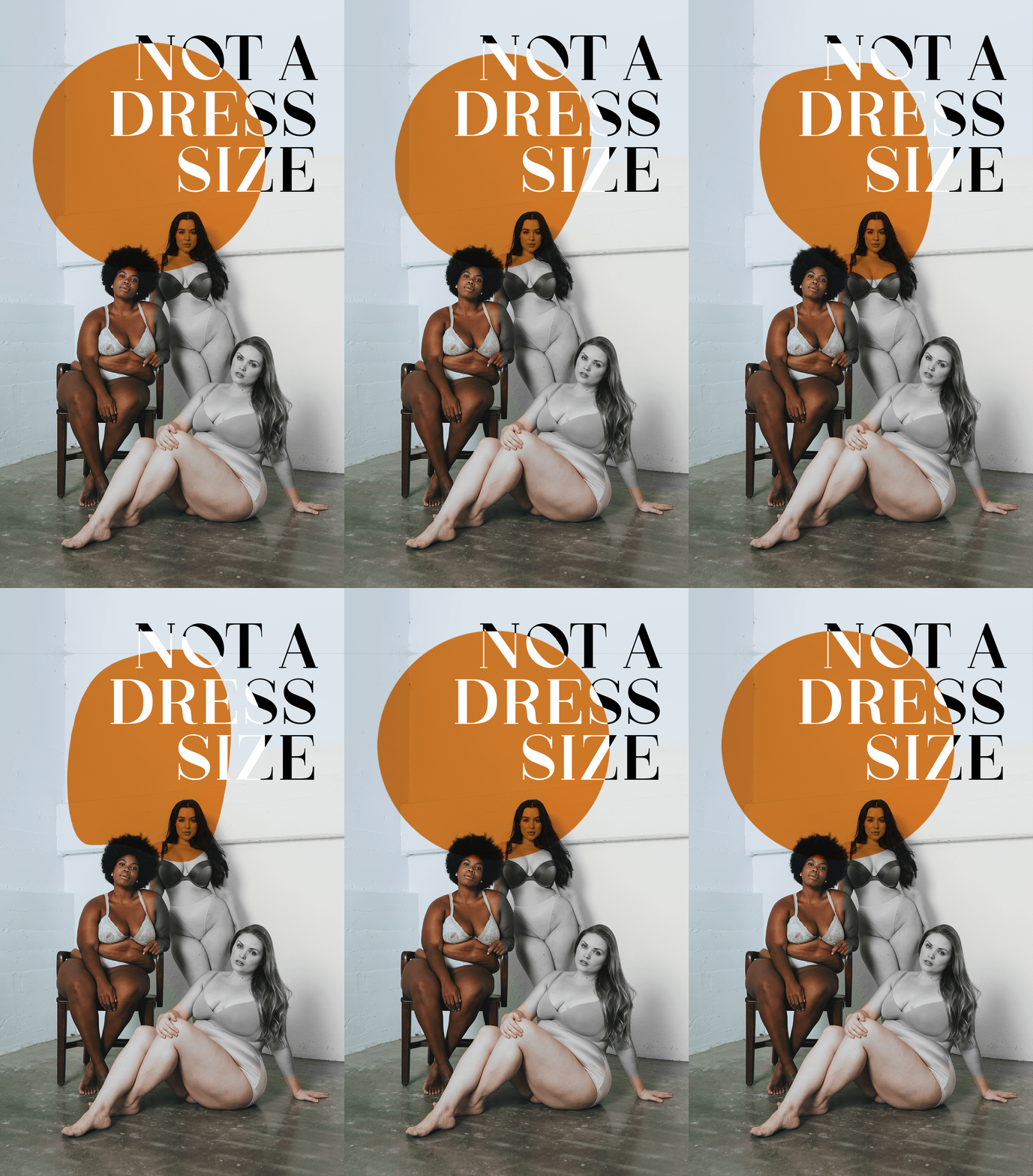
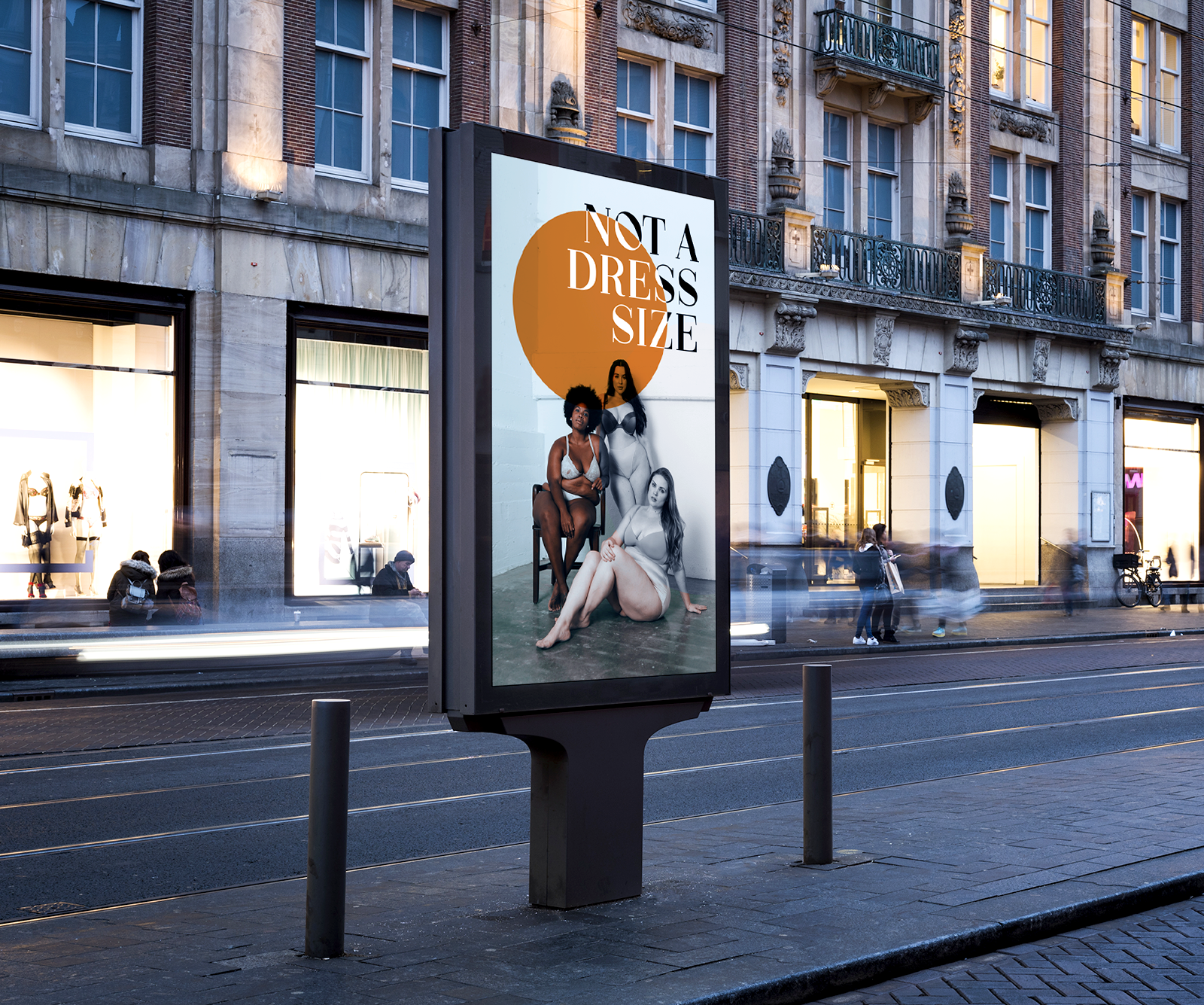
This campaign is not, as usual, aimed at the causers and body-shaming people, but at affected women. Therefore, Not A Dress Size's challenge was to create a timeless, yet attention-grabbing campaign that through its design supports the message that femininity in any form is beautiful and sufficient. The light color choice and serif typeface is meant to emphasize the positivity of empowering women's bodies.
